
Project Description
It’s not about what you buy, your experience that makes a huge difference.
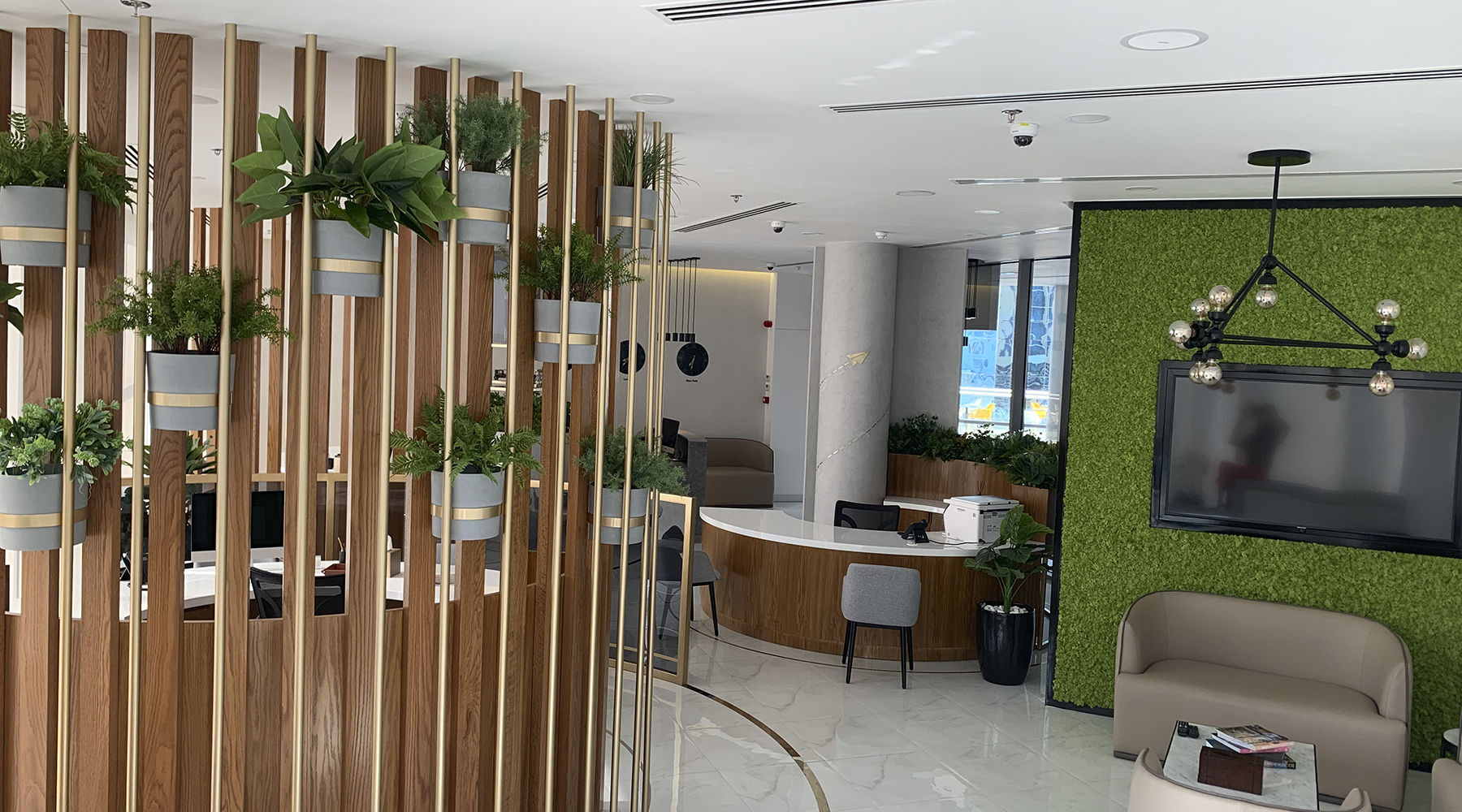
The contrast between the white color, and the teal color used in the design gives the customer comfort and reflects the cleanliness and clarity of the place.
Knowing the impact of the colors, teal color was chosen to make the brand identity for the Pharmacy, so all the upcoming branches will be a replication of the same design.
As part of our signature touch a green wall was added to reflect the bright spirit of the place.
“It’s easy to get a thousand prescriptions, but hard to find medicine, clarity and cleanliness in one place.”